![]()
This page contains all versions of the official Health Plan of San Joaquin/Mountain Valley Health Plan (“Health Plan”) logos permissible for use.
We have structured the following sections as a guide for establishing, maintaining and communicating Health Plan’s brand identity. Used as intended, Health Plan’s brand provides a cohesive look and feel across all materials.
Brand Guidelines
History of the Butterfly
Our logo has evolved over time, but our logomark has remained the same. A butterfly’s metamorphosis represents transformation – the “whole of your life changing”. As a symbol, it encourages us to accept change readily and without conflict. It beckons us to keep our trust in Health Plan as we undergo transitions in health care over time.
Logo
Health Plan’s logos share three components: the typography, the butterfly, and a solid horiztonal line.
Health Plan’s logos include all four primary palette colors: Blue (PMS 300), Green (PMS 367), Red (PMS 7620), and Orange (PMS 144). No other colors should ever be substituted. No color screens (lightening or darkening) are allowed on the logos.
Logo Guidelines
- Do not use our logomark (butterfly) by itself
- Full color logos to be used on white and light color backgrounds, not busy or colorful backgrounds.
- White logos to be used on color backgrounds.
- Black logos to be used on grayscale documents and where it is not possible to use the reverse white logo.
- Health Plan logos should not be sized smaller than 1/2” in height for print, and should have minimum free space surrounding on all sides.

- Do not modify by adding effects, rotating, or distorting (Tip: Holding the shift key when resizing will usually retain aspect ratios.)

Color Palette
Color is an integral part of our brand identity.
Our brand color palette includes both vibrant (primary palette) and neutral (secondary palette) colors. The colors complement each other and can be used in many combinations as long as the integrity of the brand is not diminished.
For print and web communications, the color palette creates a unique style and tone for the brand. The primary and secondary palettes are shown below. Primary palette is used in marketing collateral. Secondary palette supports and complements the primary colors.
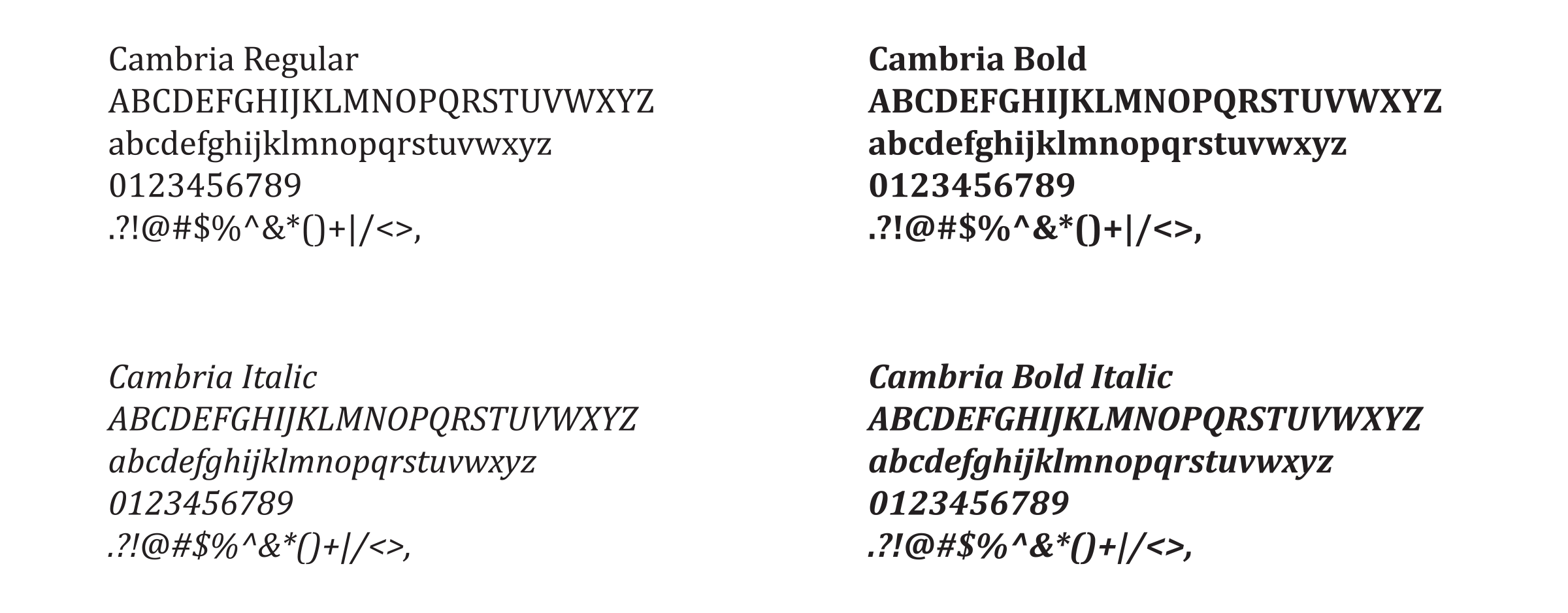
Typography
As a company, we have adopted Century Gothic and Cambria as our corporate font families. These typefaces are usually included with PC/Apple products and/or Adobe Creative Cloud subscriptions. When used together with the corporate colors, these fonts become a powerful visual communication tool. Consistent typography enables all materials to be presented in a clear, distinctive manner. The corporate font families have been chosen on the basis of its flexibility, legibility and wide availability. Consistent usage is required to support continuity in all Health Plan communications.
Century Gothic blends traditional san serif design elements with modifications that ensure suitable output from modern digital systems. Century Gothic should be used as the primary font in marketing materials for headlines, body copy and other typography treatments, where small font treatments are required.

Cambria brings a modern spin to a serif font. It was specifically designed for on-screen reading and to be aesthetically pleasing when printed at small sizes. Cambria is Health Plan’s secondary font to be used for subheads, callouts and photo captions. This font is also reserved for body copy in publications, technical/legal, member and provider-facing documents (eg. Summary Plan Descriptions) and all general correspondence.
Photography
Photography is an essential component of Health Plan’s brand. We provide more than health insurance – we bring the power of community to health care. That is why the images we use are indicative of our diverse membership and community.
Photographs that best represent Health Plan’s identity are vibrant images of people shown within the context of their environment (real-life situations). The photos should convey:
- Warmth
- Ethnic diversity
- Healthy living
- A social or engaging atmosphere

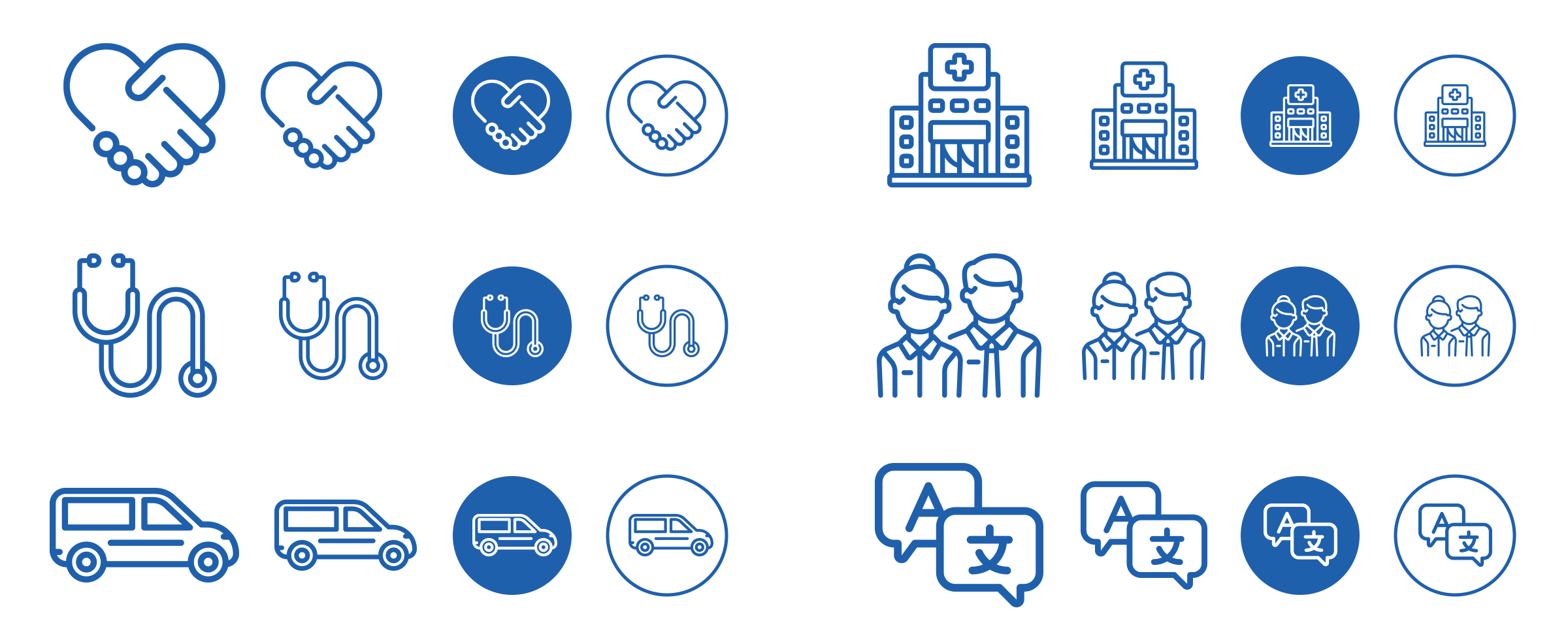
Icons
Health Plan has developed a suite of icons that create cohesion within our materials. Below are samples of the icon style we use.
Please note Health Plan’s logos are trademarks and must be used in accordance with Health Plan’s brand guidelines, outlined above.
Please tell us a little bit about yourself and how you will be using our logo(s).
Health Plan is committed to ensuring proper use, accuracy, and quality of our brand elements. We reserve the right to approve use and application of all brand elements, including but not limited to graphics, imagery and text. To reach a member of our Marketing Team, please email HPSJCommunications@hpsj.com or call 1-209-942-6300.
Health Plan’s logos are intended solely for news media and other authorized users. Any use of Health Plan’s logos or other trademarks without the express, written permission of Health Plan is strictly prohibited.
Posted on December 17th, 2024 and last modified on December 30th, 2024.
top